IF Museum
IF Museum helps audiences explore math and science through visual, hands-on experiences. These experiences translate abstract concepts into visible geometric forms, allowing visitors to understand complex ideas.
This rebranding began by identifying geometry as the museum’s core language.
I used simple geometric forms as a design system to simplify complexity and lower the barrier often associated with math and science.
IF Museum
IF Museum helps audiences explore math and science through visual, hands-on experiences. These experiences translate abstract concepts into visible geometric forms, allowing visitors to understand complex ideas.
This rebranding began by identifying geometry as the museum’s core language. I used simple geometric forms as a design system to simplify complexity and lower the barrier often associated with math and science.
IF Museum
IF Museum helps audiences explore math and science through visual, hands-on experiences. These experiences translate abstract concepts into visible geometric forms, allowing visitors to understand complex ideas.
This rebranding began by identifying geometry as the museum’s core language.
I used simple geometric forms as a design system to simplify complexity and lower the barrier often associated with math and science.

Logo Design
The name IF reflects the conditional logic fundamental to math and science, where ideas begin with a simple premise: what if?
Building on this logic, the logo is constructed from the most essential geometric elements, dots and basic shapes, establishing a visual system that is clear, open, and accessible.

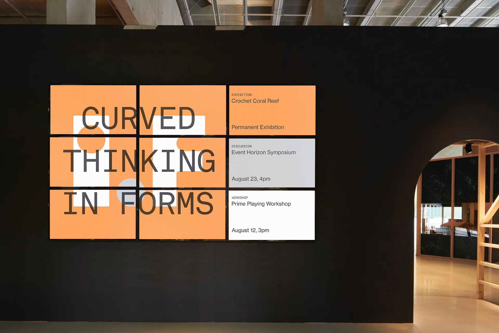
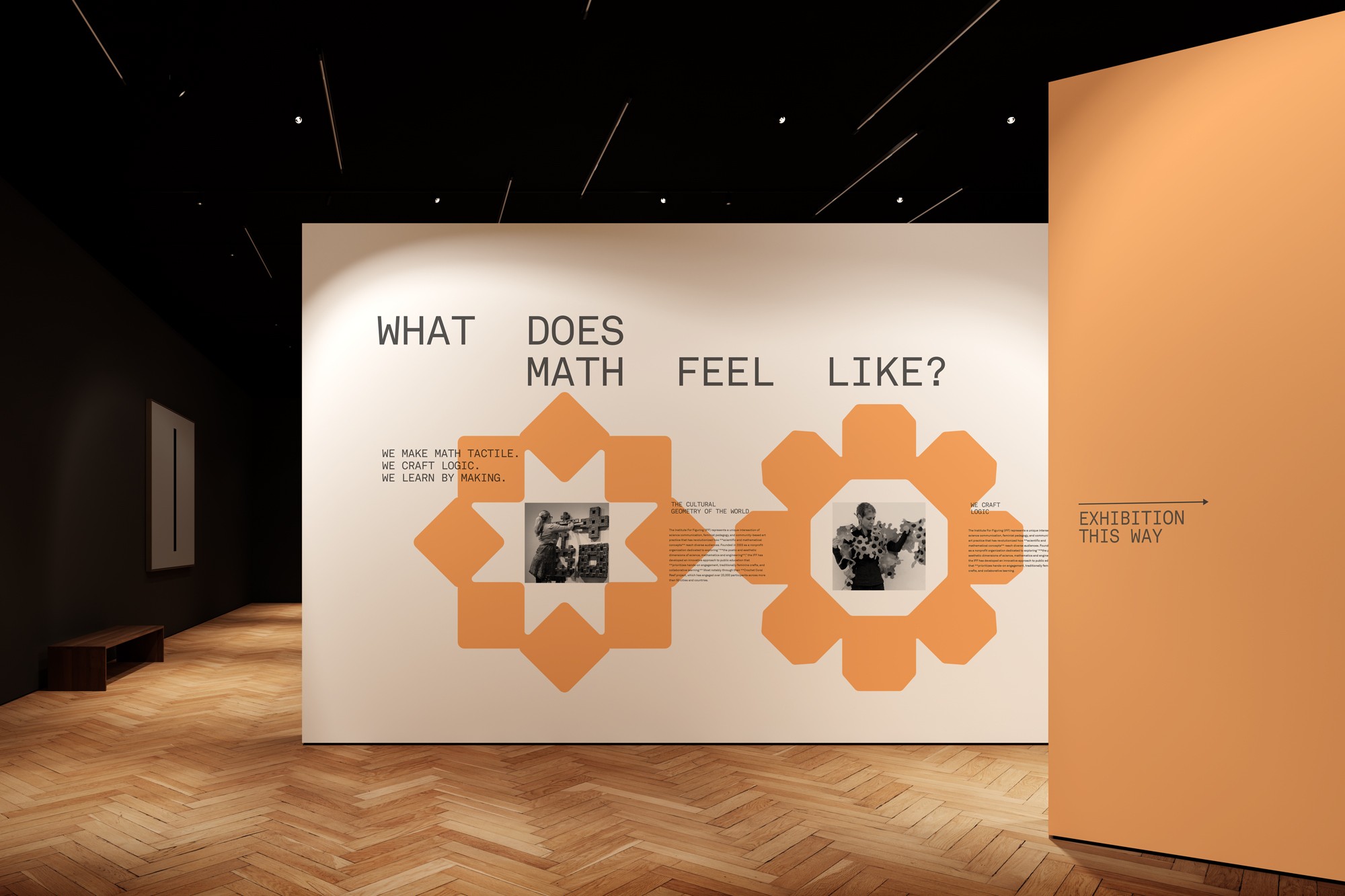
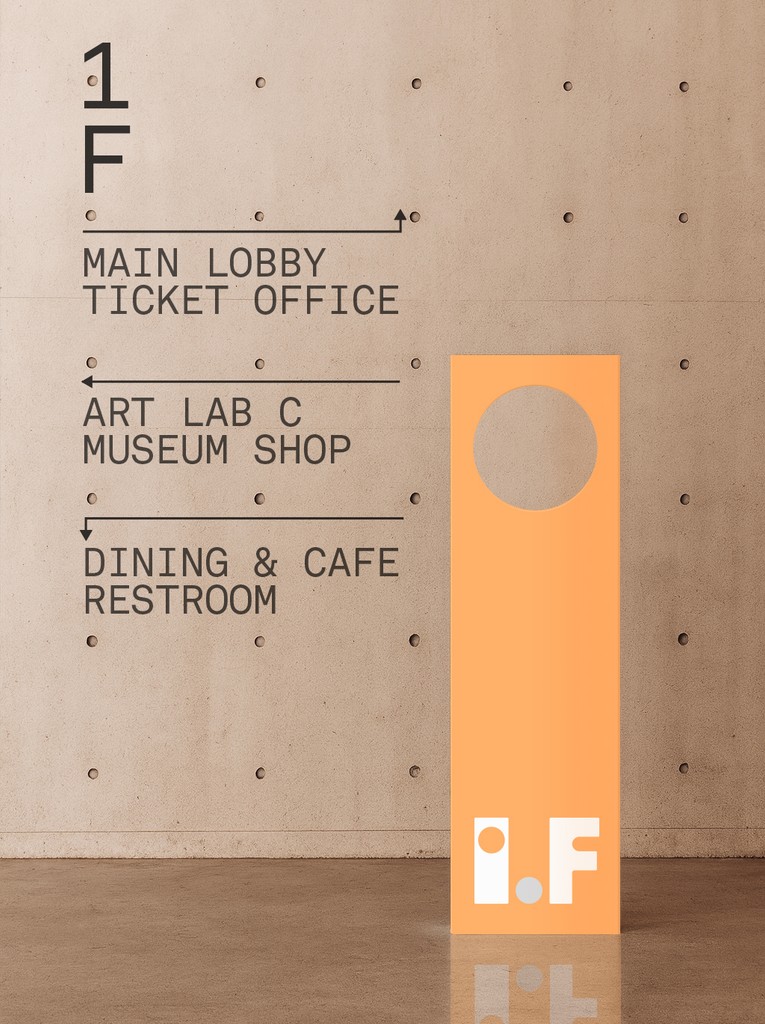
Spatial Design
The spatial design extends the visual identity system, maintaining continuity between the museum’s interior and exterior environments.
Program schedule screens, an exhibition wall, wayfinding, and an exterior promotional banner were developed as a single framework, creating a seamless visual and spatial experience across the site.


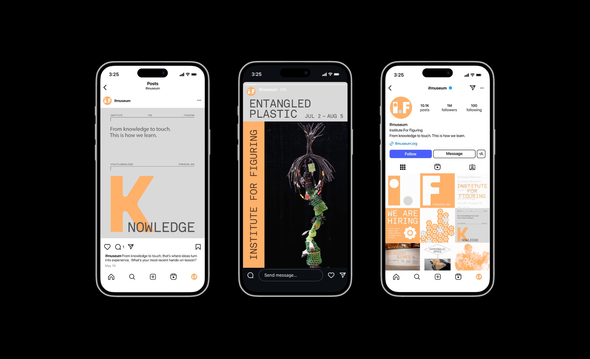
Digital Experience Design
Digital Experience Design
For the digital experience design, I focused on the museum’s primary users—visitors interested in exploring current exhibitions and workshops. The homepage highlights key programs, while detailed information is accessible with a single click.
When a visitor decides to participate, the flow leads into a calendar-based reservation and ticket purchase process, making it easy to move from interest to engagement.
For the digital experience design, I focused on the museum’s primary users—visitors interested in exploring current exhibitions and workshops. The homepage highlights key programs, while detailed information is accessible with a single click.
For the digital experience design, I focused on the museum’s primary users—visitors interested in exploring current exhibitions and workshops. The homepage highlights key programs, while detailed information is accessible with a single click.
When a visitor decides to participate, the flow leads into a calendar-based reservation and ticket purchase process, making it easy to move from interest to engagement.

Print Design
Drawing from the geometric logic of the logo, I designed business cards, a letterhead, and an envelope that clearly express IF Museum’s visual identity in print.
The envelope’s patterned back extends the logo’s elements to reflect the museum’s themes of repetition and transformation, while the enlarged and overlapping logo treatment encourages viewers to infer the whole from its parts—a visual gesture aligned with the museum’s exploratory approach.
Print Design
Drawing from the geometric logic of the logo,
I designed business cards, a letterhead, and an envelope that clearly express IF Museum’s visual identity in print.
The envelope’s patterned back extends the logo’s elements to reflect the museum’s themes of repetition and transformation, while the enlarged and overlapping logo treatment encourages viewers to infer the whole from its parts—a visual gesture aligned with the museum’s exploratory approach.
Print Design
Drawing from the geometric logic of the logo, I designed business cards, a letterhead, and an envelope that clearly express IF Museum’s visual identity in print.
The envelope’s patterned back extends the logo’s elements to reflect the museum’s themes of repetition and transformation, while the enlarged and overlapping logo treatment encourages viewers to infer the whole from its parts—a visual gesture aligned with the museum’s exploratory approach.